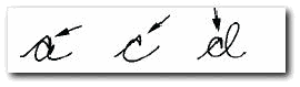
Capitals, and lowercase letters "o", "a" "m" and "n" magnified

In each set, select the ONEchoice in each question that best describes your handwriting sample, then checkmark any further questions about that sample that apply.


1 - Capitals: Choose what describes most of the capitals SIZE the best...


Capitals much larger than, and out of proportion to, smaller letters (like 3x's larger or more)...
 

Capitals small, less than twice the size of normal letters...
 

Capitals about the right size (twice the size of lowercase letters...)
 

2 - Capitals: Choose what describes most of the capitals STYLE the best...


Capitals plain and ALMOST printlike, (kind of like really simple cursive), regular size...
 

Cursive capitals made plain and large (larger than twice smaller letter size)...
 

Cursive capitals made very plain, but the right size...
 

Capitals plain, angular, and awkward looking...
 

Capitals actually printed
 

Cursive capitals formed just like they are taught in school, and correct size
 

Nothing fits


Some or all capitals are unusually ornamented or flowery...


Capitals made with heavy pressure, heavier than smaller letters


EXTRA Incurve, or extra Lead-in stroke, present with some/all capitals (not M's and N's)...


Large loop present on 2 or more incurves, or lead-in strokes, with some/all capitals...


Small loop present on 2 or more incurves, or lead-in strokes, with some/all capitals...

3 - Capital M's and N's


First upstroke or lead-in stroke of M much higher than the rest of the letter
 

Second stroke or first hump of M much higher than the rest of the letter
 

M made with three vertical strokes and one horizontal "roof" stroke...
 

M made normal, just like in school, nothing unusual...
 

Nothing fits...


Elaborate Loop on either the lead-in stroke or at the end of the third stroke...

4 - First strokes of capitals M and N


First Upstroke is LEFT of the first Downstroke

First Upstroke is RIGHT of the first Downstroke

First Upstroke RETRACES the first Downstroke

There is NO initial Downstroke.


5 - Loops in lowercase letters


There are no inner loops, letter is just clean and crisp


There are entry loops on the left side, but no exit loops on the right


The exit loops are only on the right side


There are loops in both the left and right side


The letter is open at the top... with or without loops
image

Noticeable, pointy-like hooks or "stabs" anywhere...

6 - Slant of the humps on the letters "m" and"n"


Humps slant uphill

Humps slant downhill

No noticeable slant


7 - Shape of the tops of the humps

Rounded on top

Both rounded and pointed at various times

Needle sharp points

.